In Design, Space Is All You Need
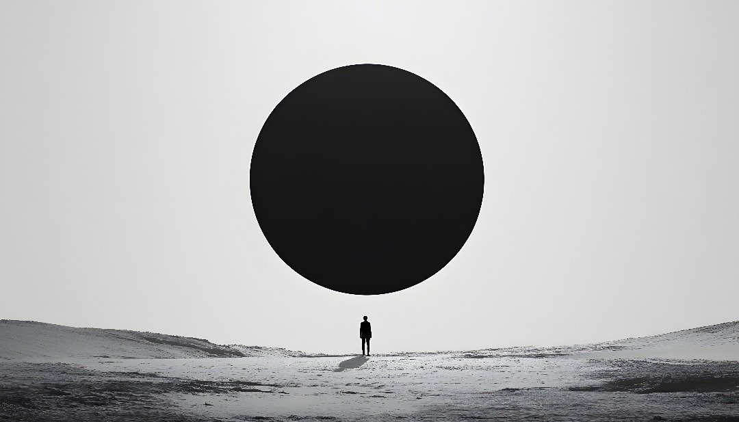
Table of contents:
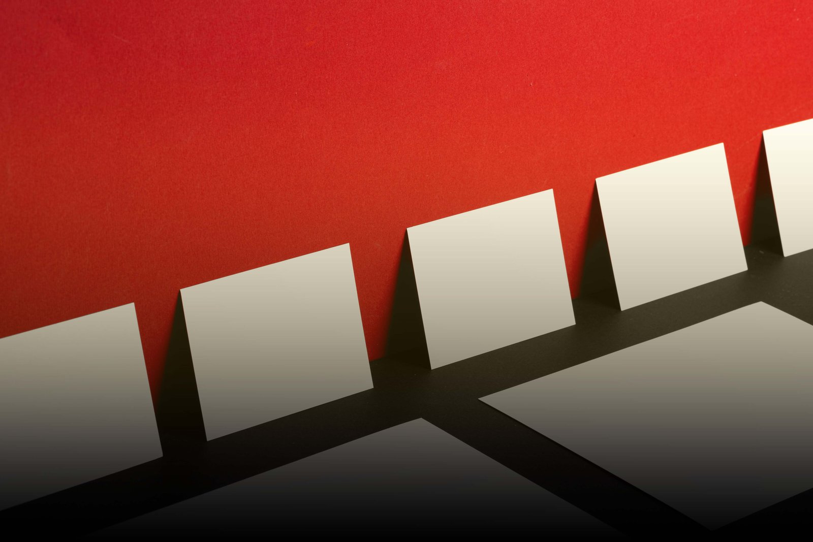
The Power of What You Don’t See
In design, space is not emptiness; it is intention. Like silence in music, it gives rhythm, emotion, and clarity to every composition. Space allows ideas to breathe and messages to land. Without it, even the most creative design can feel loud and confusing.
Many designers rush to fill every inch of the screen or page, mistaking fullness for richness. Yet sometimes, what your design truly needs is not another element; it is the absence of one. When used wisely, space transforms design from cluttered to captivating.
At GradatimConcept, we design with restraint, clarity, and intention. Great design is not about what you add; it’s about what you decide to leave out. The best work knows when to pause.
Understanding Balance in Design
Balance is the invisible thread that holds a design together. It determines how comfortable the viewer feels when interacting with a layout, logo, or interface. When balance is off, users might not know why something feels wrong—they just feel it.
Designers use several types of balance to create stability and harmony:
- Symmetrical Balance: Elements mirror each other across a central axis, giving a sense of formality and calm. Think of classic architecture or corporate branding where order inspires trust.
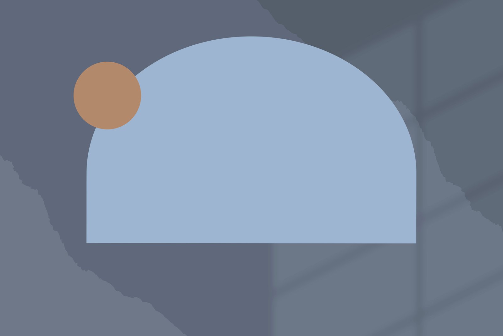
- Asymmetrical Balance: Unequal elements are arranged thoughtfully to achieve visual harmony. A large image can be balanced by smaller text blocks or contrasting colors. This method is modern and dynamic; used often by brands like Apple or Spotify.
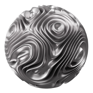
- Radial Balance: Elements radiate from a central point, drawing attention inward. You see this in mandalas, watch designs, and circular logos where focus is naturally guided.
- Mosaic (Crystallographic) Balance: Similar elements are evenly distributed, with no single focal point. This works well for pattern-heavy visuals or portfolio grids, creating harmony through repetition.
Regardless of style, the goal is the same: visual stability. Balance helps users focus on what truly matters, without feeling overwhelmed.
The Role of Negative Space
Negative space, also called white space, is the area between and around elements. It may look empty, but it’s one of the most powerful tools in visual communication. It directs attention, builds contrast, and helps users process information effortlessly.
Passive negative space simply fills natural gaps, maintaining order and breathing room. It’s often used in symmetrical layouts to prevent visual congestion. Active negative space, on the other hand, is deliberate and expressive. It shapes meaning; like the hidden arrow in the FedEx logo or the balance between content blocks on Apple’s website. It doesn’t just sit quietly; it speaks.
In digital products, negative space enhances usability. A cluttered interface frustrates users, while generous spacing improves readability, focus, and emotional comfort. It’s what makes minimalist design feel luxurious.
Why Space Matters in UI and UX
In user interface design, space guides flow. It determines how quickly users understand hierarchy—what’s a button, a headline, or a call to action. Too little space, and everything competes for attention. Too much, and users might get lost.
White space also affects emotion. A crowded design feels stressful. A balanced one feels intuitive and calm. This is why premium brands rely heavily on spacing; it communicates confidence and care.
From landing pages to mobile apps, spacing defines perception. It can make a startup feel established or a local brand feel global. When design breathes, your message speaks louder.
How to Design With Space in Mind
To make space work for you, start by thinking of it as an element, not an afterthought. Every pixel, margin, and gap should serve a purpose.
- Start with hierarchy: Identify what users should notice first, second, and last. Use space to guide their eyes naturally through that journey.
- Design grids, not chaos: A consistent grid system keeps spacing intentional. It allows the design to feel structured, even when asymmetrical.
- Use contrast wisely: Contrast between text, images, and empty space creates rhythm. Don’t be afraid of silence in your design; it adds emphasis.
- Test for comfort: Observe how users interact with your design. If they hesitate or miss important information, it’s often a spacing problem, not a content one.
Remember: balance is not about perfection; it’s about flow.
Final Thoughts
Like silence in a speech or rest in a melody, space gives meaning to everything around it. It creates emotion, structure, and elegance. Without space, design becomes noise.
The next time you design a website, product, or campaign, ask yourself: does it breathe? Because sometimes, the most powerful thing you can add to a design is nothing at all.
We design with purpose. We design with space. We are GradatimConcept.


![]() Let's talk about your project!
Let's talk about your project!