Your Product Doesn’t Need More Screens
Table of contents:
The Feature Trap: Why More Screens Don't Mean More Sales
In the world of product development, there is a pervasive and expensive myth: that the solution to any problem is adding another feature. When a customer struggles with a task, the immediate, costly reaction is often to design a new screen, create an extra button, or bolt on another piece of functionality.
This path leads directly to feature bloat (a product so dense with options that the user gets lost, intimidated, or simply gives up). We are hardwired to think that more equals better, but in the context of user experience, it is the efficient journey that wins.
At GradatimConcept, we operate from a different principle: Your product does not need more screens; it needs better flow. We focus on eliminating friction, not accumulating features.
The Anatomy of Frictionless Flow
Consider the user journey like a river. A poor product design is full of rocks and dams (each click, decision, or input field is an obstacle slowing the current). A great product design is a deep, fast-moving channel.
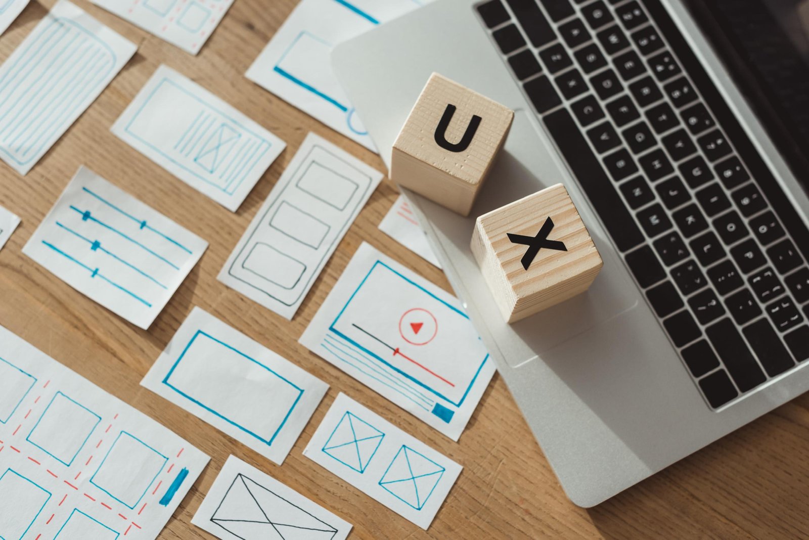
Flow Mapping is the discipline of charting this river. It is not just a fancy diagram; it is a strategic exercise to visualize every single user action from Point A (initial need) to Point B (task completion). By mapping the flow, we stop thinking about screens and start thinking about transitions.
The goal is to reduce the Cognitive Load on the user. Every time a user has to pause, analyze an option, or remember a previous input, you have introduced friction. By ruthlessly simplifying the path, we increase completion rates and improve user satisfaction, which directly impacts your bottom line.
Why Flow Mapping Saves Time and Reduces Waste
Development time is expensive. The biggest source of waste in software projects is building features that are either never used or poorly integrated. Flow mapping is your strongest defense against this waste:
- Eliminates Ghost Features: By defining the essential path first, we expose features that are unnecessary or redundant. Why build a complex settings panel if 90% of users only need one toggle?
- Streamlines Development Sprints: Developers receive crystal-clear instructions: "The user must get from this step to this step with two clicks." This precision removes ambiguity, reducing back-and-forth and costly re-writes.
- Uncovers Bottlenecks Before Coding: It is infinitely cheaper to draw a bottleneck on a whiteboard and fix it than it is to re-code an entire section of your application because the user gets stuck on a confusing input field.
- Prioritizes True Value: A good flow map highlights the moments of truth (the points where the user is most likely to convert, pay, or complete a core task). Resources are then allocated to polish these critical transitions, not auxiliary features.
When the flow is perfect, the product feels intuitive. It feels like it was designed just for them.
The Silent Killer of Retention: Cognitive Overload
The moment a user registers for your service, they are already on a high-speed path to evaluation. If they cannot quickly and easily achieve their core goal, they will leave. This is especially true for mobile interfaces where screen real estate is at a premium.
Feature bloat is a silent killer of retention because it introduces choice paralysis. When faced with ten options, a user often chooses none. A streamlined flow, however, funnels the user toward a single, clear, and valuable action. This is not manipulation; it’s guidance.
By making the most critical task the easiest task, we transform users from passive browsers into active, retained customers. The effort you put into design is an investment in your user's energy, which they repay through loyalty.
A Shift in Mindset: Experience Over Inventory
Stop compiling a laundry list of features and start designing an experience. This means asking a different set of questions at the start of any project:
- The Old Question: What else can we build?
- The Flow Question: How quickly can the user accomplish the main goal?
- The Old Question: How can we fit this new feature onto the current screen?
- The Flow Question: Can this step be removed entirely?
The ultimate expression of great design is not complexity; it is simplicity. It is the invisible product that works so well you do not even notice the steps.
Final Thoughts
Focusing on flow is the difference between a product that is merely functional and one that is profitable. The path of least resistance for your user is the path of maximum return for your business.
Before you approve the next feature request, pause. Map the flow. Challenge every transition. Ask yourself: Is this new screen a shortcut, or a detour?
We build systems that feel simple, because they are strategically engineered. We are GradatimConcept.
Let's talk about your project!
